By CHRIS HECKMANN
Color space is one of the most difficult artistic concepts to understand – but it plays an important role in photography, videography, and visual post-production. The ability to manipulate the image, especially color, has never been more powerful or exciting. But as the cliche expression goes, “with great power comes great responsibility.” So, what is color space? We’re going to answer that question by outlining the color space definition. By the end, you’ll know why it’s important and how to get started with it.
First, let’s define color space
Okay, this is an incredibly difficult concept to understand – and it might be even tougher to explain. In simplest terms, color space is a fixed spectrum of colors assigned by number values. Now, there’s a lot more to it than just that; we’ll get to the rest in a bit.
But before we do, let’s review this video from Tony Dae. Here, Tony explains this concept in a very digestible way with examples from Da Vinci Resolve.
These spaces are an incredibly important part of color grading and color correction. Having advanced knowledge of this process will make your work look better, and appear more professional.
So, without further ado, let’s define color space.
COLOR SPACE DEFINITION
What is color space?
A color space is a range of colors on a spectrum that can be interpreted and displayed on a visual plane. Many of these displays are interpreted through an RGB (Red, Green, Blue) chromaticity diagram, then processed and displayed on digital/analog images. These are further broken down into ranges, or “gamuts.”
What is a gamut?
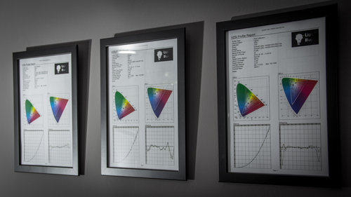
A gamut is a subset of a perceivable color space, represented on the RGB spectrum in three-dimensional space by its HSL, or Hue, Saturation, and Lightness. This image from BENQ shows standard color gamuts within a specific space. Each gamut is represented by a colored triangle.
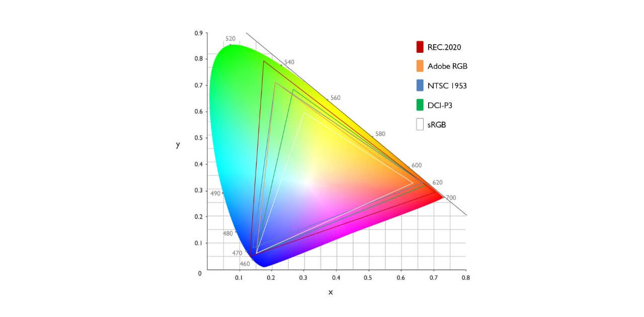
Essentially, the wider the gamut, the more colors the artist has to play with. That’s why Rec 2020 – outlined in the red triangle in the image above – is such an exciting gamut for colorists. For more on this topic, check out the video from Khan Academy below.
Gamuts play an important role in understanding this concept. Perhaps the best way to summarize gamuts would be to say they’re simply the part of a space that can be reproduced, i.e., represented in that gamut.
WHAT COLOR SPACE SHOULD I USE?
What is a reference space?
In 1931, the Commission Internationale de l’Eclairage (CIE), outlined the CIE 1931 RGB and CIE 1931 XYZ. These two spaces were the product of years of research – and they marked a major leap forward for how we understand how people perceive color.
One of the primary goals is to find the closest approximation of what we see and translate it into numbers. Through this, we can outline a gamut that expresses a consensus range of colors.
For more on this concept and how it relates to spectral colors, check out the video from Khan Academy below.
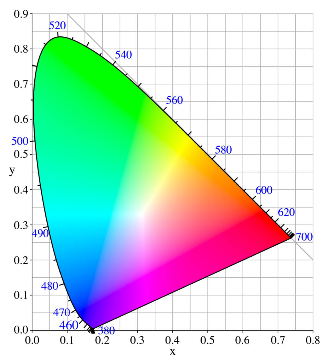
Each version of CIE color space contains the same colors – but they allocate their amount in different ways. For example, this image uploaded to Wikipedia represents the CIE 1931 color space.
This other image – which depicts CIE 1976 – may depict the same colors, but they’re allocated in a different way.
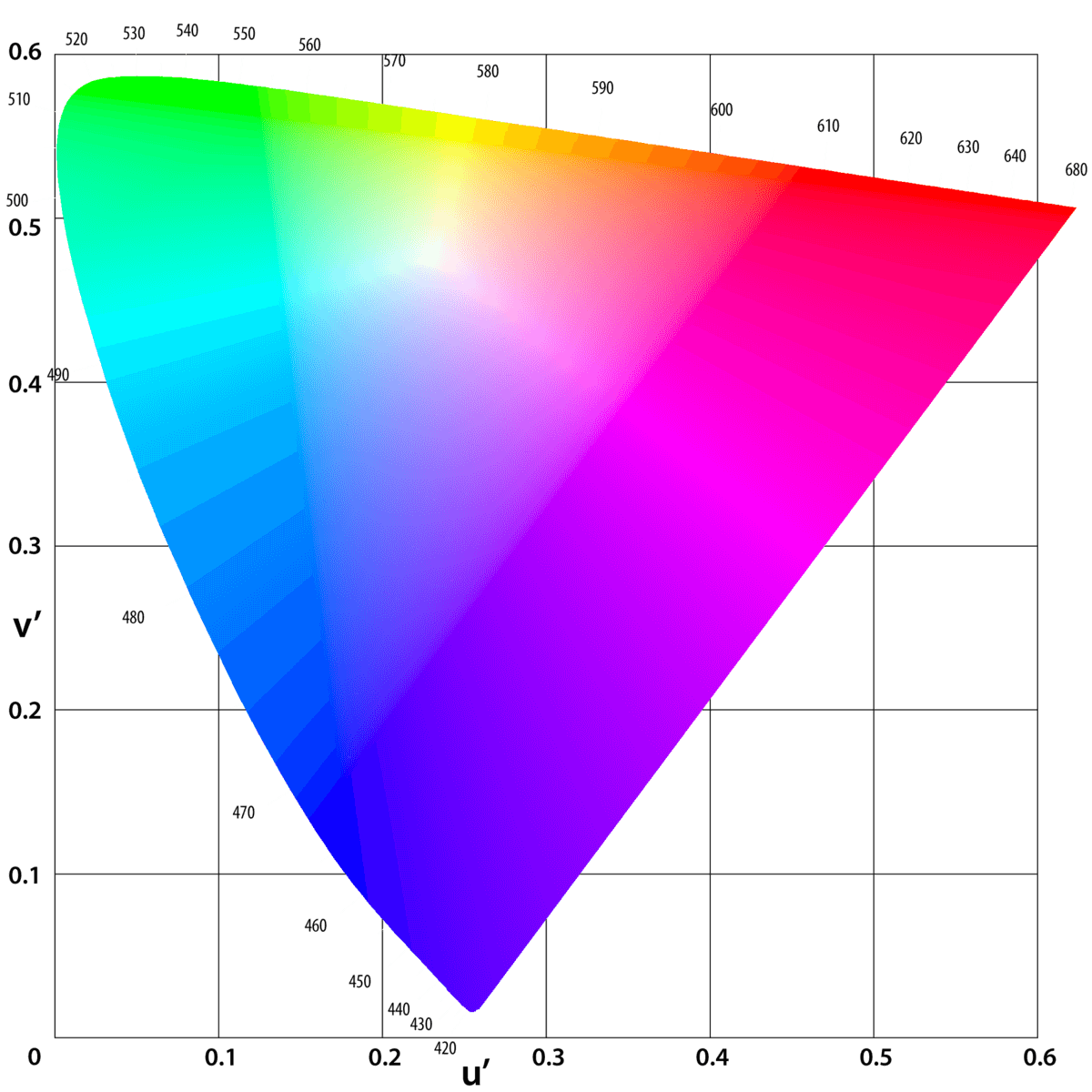
When we plot the same point on these two charts, we get two entirely different colors. Just look at how much higher the white point is on the CIE 1976 graph than it is on the CIE 1931 graph.
This is the fundamental idea behind reference color; which is to say: spaces can be used to reference how accurate (or inaccurate) they’re going to appear based on what we know about other spaces.
Why is color space important?
Color space is important because it dictates how we see images. Sometimes, a space isn’t applied correctly, which results in a messed-up image. Other times, a space is applied correctly for one type of display but will make the image appear wonky on another type of display. That’s why we have standardized spaces. But what is a standardized color space?
A standardized color space includes a range of colors optimized for a wide set of displays. These types of spaces are often built for computer monitors, television displays, or projectors. This next video from Techquickie explores how the use of different spaces can have an immense effect on images.
So, you might be wondering: what color space should I use? Well, it depends on what you want your image to look like and what tools you have available – RGB, sRGB, and CMYK color spaces will all have different effects on your work.
Whether you’re a colorist or simply somebody looking to get the most color-accurate image possible, this is an important concept to understand.
In this video, you will learn all you need to know about Color Theory. After watching this you will be able to implement these techniques to elevate the quality of your work.